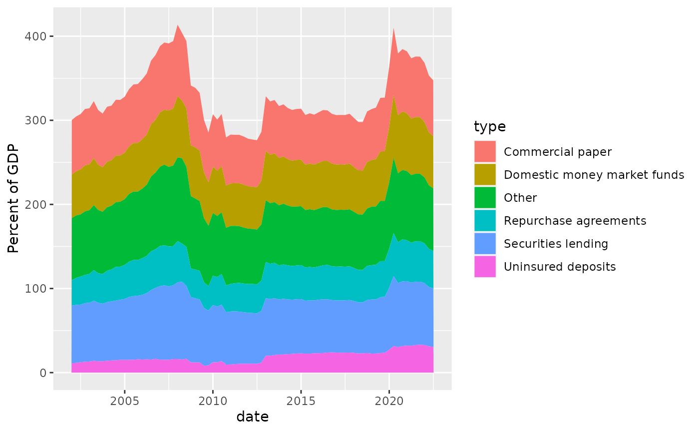
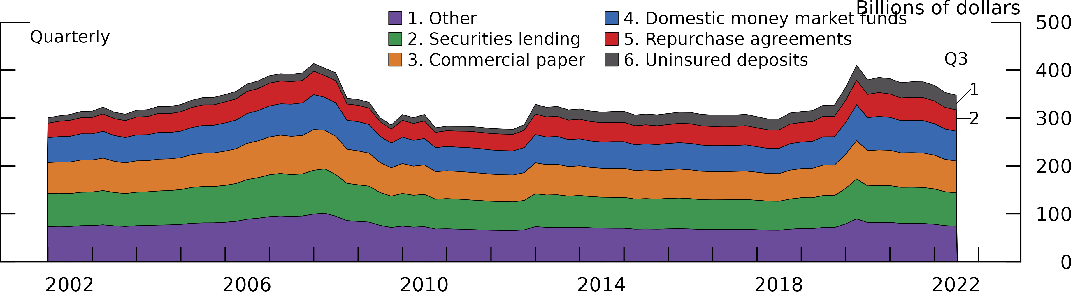
This section will demo how to create a stacked area plot in fedplot style, using Figure 4.1 of the November 2022 FSR as a reference.
Example area plot
First, we load ggplot2, fedplot (which
contains the sample dataset FSR_4_1), and
scales.
#devtools::load_all()
library(ggplot2)
library(fedplot)
#> Warning in load_fed_font(): Cannot load font 'ITCFranklinGothic LT BookCn'; not
#> installed
library(scales)
library(forcats)

packageVersion("fedplot")
#> [1] '0.9.0'
head(FSR_4_1)
#> # A tibble: 6 × 3
#>   date       type                        value
#>   <date>     <chr>                       <dbl>
#> 1 2002-01-01 Other                        73.8
#> 2 2002-01-01 Securities lending           68.5
#> 3 2002-01-01 Commercial paper             64.8
#> 4 2002-01-01 Domestic money market funds  51.8
#> 5 2002-01-01 Repurchase agreements        30.2
#> 6 2002-01-01 Uninsured deposits           11.2
We can construct the area plot using standard ggplot2
functions:
Now we customize it:
linewidth <- getOption("fedplot.linewidth_adj") * 0.25
font_size <- unit(getOption("fedplot.font_size") * 7L / 8L / ggplot2::.pt, "bigpts")
font_family <- getOption("fedplot.font_family")
maxdate <- max(FSR_4_1$date)

FSR_4_1 |>
  dplyr::mutate(
    type = dplyr::case_when(
      type == "Other" ~ "1. Other",
      type == "Securities lending" ~ "2. Securities lending",
      type == "Commercial paper" ~ "3. Commercial paper",
      type == "Domestic money market funds" ~ "4. Domestic money market funds",
      type == "Repurchase agreements" ~ "5. Repurchase agreements",
      type == "Uninsured deposits" ~ "6. Uninsured deposits",
      .default = "N/A")) |>
  dplyr::mutate(type=forcats::fct_rev(factor(type))) |>
  #dplyr::mutate(type=factor(type)) |>
  ggplot(aes(x = date, y = value, fill=type)) +
  geom_area(color="black", linewidth=linewidth, key_glyph=draw_key_square, outline.type="full") + # TBH looks better with color="white"...
  labs(y="Billions of dollars") +
  geom_hline_zero() +
  scale_x_date(minor_breaks=seq(from=as.Date("2002-01-01"), to=as.Date("2023-01-01"), by="1 years"),
               breaks=seq(from=as.Date("2002-06-30"), to=as.Date("2022-06-30"), by="4 years"),
               date_labels="%Y",
               expand=expansion(mult=.05)) +
  scale_y_continuous(sec.axis = dup_axis(),
                   breaks = seq(0, 500, by=100),
                   limits = c(0, 500),
                   expand = expansion(mult=0),
                   labels = scales::label_number(style_negative = "minus")) +
  annotate_last_date(nudge_y = 350) +

  # Demo of how we could start implementing the number annotations...
  # See also: https://stackoverflow.com/questions/10393956/add-direct-labels-to-ggplot2-geom-area-chart
  geom_segment(aes(x=maxdate, y=330, xend=maxdate+120, yend=360), linewidth=linewidth, lineend="round") +
  annotate("text", x=maxdate+150, y=360, label="1", size=font_size, family=font_family) +
  geom_segment(aes(x=maxdate, y=300, xend=maxdate+120, yend=300), linewidth=linewidth, lineend="round") +
  annotate("text", x=maxdate+150, y=300, label="2", size=font_size, family=font_family) +

  # Hack to add an outline around the stacked area geom
  #geom_line(aes(ymax=value), position="stack", linewidth=linewidth) +

  guides(fill=guide_legend(ncol=2, reverse=TRUE)) +
  theme_fed(legend_position = c(.38, 1.1),
            fill_palette=fedplot::bsvr_colors,
            size='wide')
Note that to achieve the exact ordering used in the FSR (where the stacked areas have a reverse order but the legend has an alphabetical order) we can use several two tricks:
- Use
forcats::fct_revto reverse the order of thetypevariable (see also this link). - Call
guide_legend()with thereverse=TRUEoption.
Lastly, we want to export the chart so it matches the required image characteristics:
save_plot('areaplot', extension='all')
#> saved 'areaplot.pdf' (1.69296638166501x6.13546463673551; dpi=300)
#> saved 'areaplot.eps' (1.69296638166501x6.13546463673551; dpi=300)
#> saved 'areaplot.png' (1.69296638166501x6.13546463673551; dpi=600)
After exporting through save_plot, the chart looks like
this:
Pending tasks:
- Add the pattern area, using ggpattern.
- Get data in percent of GDP instead of USD. Also check the actual values for the OTHER category.
- Get correct colors
- Add numbers to legends and annotations
- Add black stripped area for the period from 2008:Q4 to 2012:Q4