This section will demo how to create a barplot in fedplot style, using Figure 2.4 of the November 2022 FSR as a reference.
Example barplot
First, we load the required packages(ggplot2 and
fedplot, plus dplyr and scales).
Note that the sample dataset FSR_2_4 is part of the
fedplot package.
#devtools::load_all()
library(ggplot2)
library(dplyr, warn.conflict=FALSE)
library(fedplot)
#> Warning in load_fed_font(): Cannot load font 'ITCFranklinGothic LT BookCn'; not
#> installed
library(scales)

packageVersion("fedplot")
#> [1] '0.9.0'
head(FSR_2_4)
#> # A tibble: 6 × 3
#>   date       risky_debt_type                value
#>   <date>     <chr>                          <dbl>
#> 1 2004-04-01 Institutional leveraged loans  15.6
#> 2 2004-04-01 High-yield and unrated bonds  -12.8
#> 3 2004-07-01 Institutional leveraged loans   6.33
#> 4 2004-07-01 High-yield and unrated bonds   -4.74
#> 5 2004-10-01 Institutional leveraged loans  20.9
#> 6 2004-10-01 High-yield and unrated bonds  -14.7
We can construct the barplot using standard ggplot2
functions:
# Caption disabled for FSR; enabled otherwise through labs()
caption <- "Source: Mergent, Fixed Income Securities Database; PitchBook Data, Leveraged Commentary & Data."

# If we don't want the default alphabetical order, we can do use factor() and a) use relevel() afterwards or specify the levels option.
levels <- c("Institutional leveraged loans", "High-yield and unrated bonds")

FSR_2_4 |>
  dplyr::mutate(type = factor(risky_debt_type, levels=levels)) |>
  ggplot(aes(x = date, y = value, fill=type)) +
  geom_col() +
  labs(y="Billions of dollars") # , caption=caption)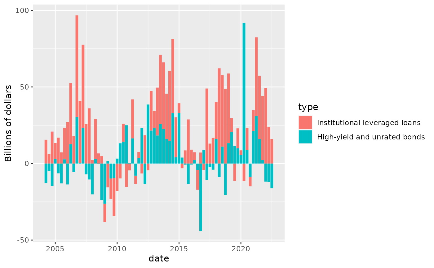
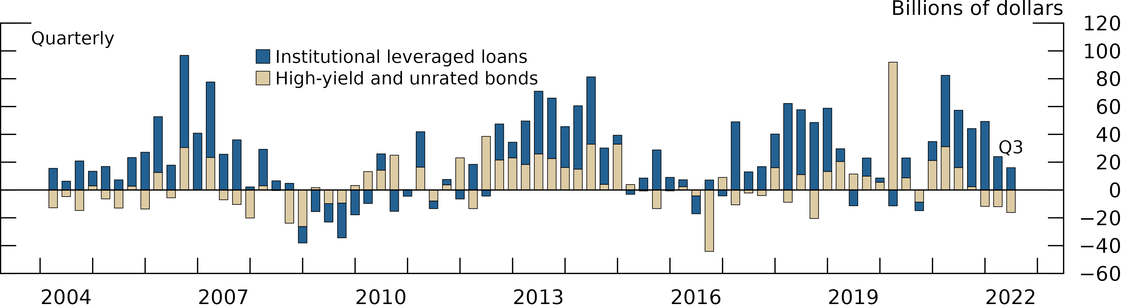
Now we customize it:
linewidth <- getOption("fedplot.linewidth_adj") * 0.25
levels <- c("Institutional leveraged loans", "High-yield and unrated bonds")

FSR_2_4 |>
  dplyr::mutate(type = factor(risky_debt_type, levels=levels)) |>
  ggplot(aes(x = date, y = value, fill=type)) +
  geom_col(color="black", linewidth=linewidth, width=60, key_glyph="square") + # Width is in days
  labs(y="Billions of dollars") +
  geom_hline_zero() +
  scale_x_date(minor_breaks=seq(from=as.Date("2003-01-01"), to=as.Date("2023-01-01"), by="1 years"),
               breaks=seq(from=as.Date("2004-06-30"), to=as.Date("2022-06-30"), by="3 years"),
               date_labels="%Y",
               expand=expansion(mult=.05)) +
  scale_y_continuous(sec.axis = dup_axis(),
                   breaks = seq(-60, 120, by=20),
                   limits = c(-60, 120),
                   expand = expansion(mult=0),
                   labels = scales::label_number(style_negative = "minus")) +
  annotate_last_date(nudge_y = 15) +
  theme_fed(legend_position = c(.24, .95),
            fill_palette=c("#236192", "#DDCBA4"),
            size='wide')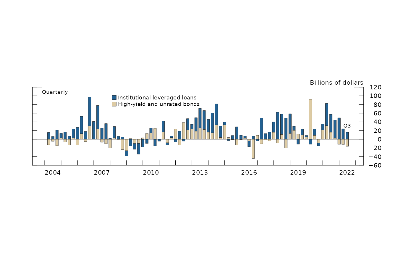
Lastly, we want to export the chart so it matches the required image characteristics:
save_plot('barplot', extension='all')
#> saved 'barplot.pdf' (1.69296638166501x6.15792557423551; dpi=300)
#> saved 'barplot.eps' (1.69296638166501x6.15792557423551; dpi=300)
#> saved 'barplot.png' (1.69296638166501x6.15792557423551; dpi=600)
After exporting through save_plot, the chart looks like
this:
Pending tasks:
- Is there a rule for the bar width? Note that it’s set in terms of days and not in an absolute size.
- Add a
geom_col_fedfunction that automatically sets the required color (black) and linewidth (0.25 times adjustment). - Automatically use the required color fill palette (which needs to be determined).