This section will demo how to create a line plot in fedplot style, using Figure 1.17 of the November 2022 FSR as a reference.
Example line plot
First, we load the required packages(ggplot2 and
fedplot, plus dplyr and scales).
Note that the sample dataset FSR_1_17 is part of the
fedplot package.
#devtools::load_all()
library(ggplot2)
library(dplyr, warn.conflict=FALSE)
library(fedplot)
#> Warning in load_fed_font(): Cannot load font 'ITCFranklinGothic LT BookCn'; not
#> installed
library(scales)
packageVersion("fedplot")
#> [1] '0.9.0'
head(FSR_1_17)
#> # A tibble: 6 × 3
#> date source value
#> <date> <chr> <dbl>
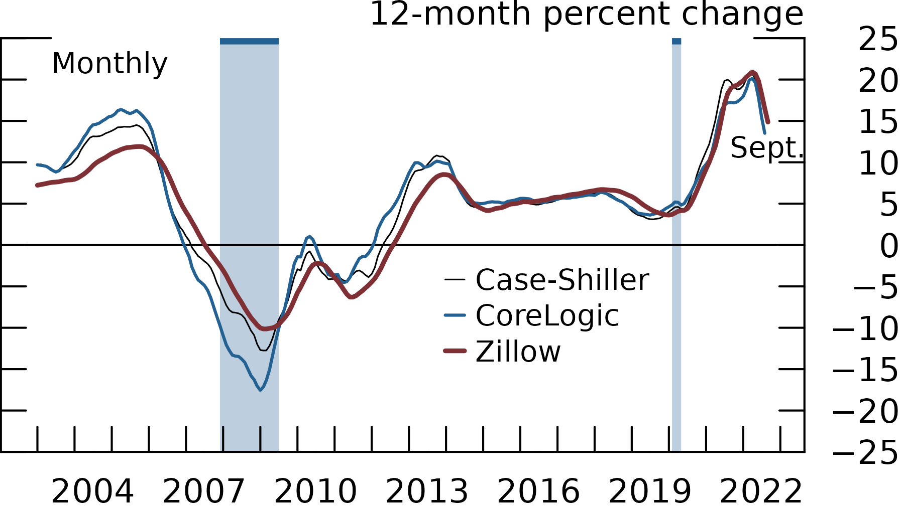
#> 1 2003-01-01 Zillow 7.23
#> 2 2003-01-01 CoreLogic 9.70
#> 3 2003-01-01 Case-Shiller 9.63
#> 4 2003-02-01 Zillow 7.30
#> 5 2003-02-01 CoreLogic 9.64
#> 6 2003-02-01 Case-Shiller 9.76We can construct the line plot using standard ggplot2
functions:
FSR_1_17 |>
  ggplot(aes(x = date, y = value, color=source)) +
  geom_line() +
  labs(y="12-month percent change")
#> Warning: Removed 3 rows containing missing values (`geom_line()`).
Now we customize it:
FSR_1_17 |>
  ggplot(aes(x = date, y = value, group=source)) +
  geom_recessions() +
  geom_hline_zero() +
  geom_line_fed() +
  labs(y = "12-month percent change") +
  scale_x_date(
       minor_breaks=seq(from=as.Date("2003-01-01"), to=as.Date("2023-01-01"), by="1 years"),
       breaks=seq(from=as.Date("2004-06-30"), to=as.Date("2023-06-30"), by="3 years"),
       date_labels="%Y",
       expand=expansion(mult=.05)) +
  scale_y_continuous(
    sec.axis = dup_axis(),
    breaks = seq(-25, 25, by=5),
    limits = c(-25, 25),
    expand = expansion(mult=0),
    labels = scales::label_number(style_negative = "minus")) +
  annotate_last_date(nudge_y = -3, nudge_x = 0) +
  theme_fed(legend_position = c(.55, .5))
Lastly, we want to export the chart so it matches the required image characteristics:
save_plot('lineplot', extension='all')
#> saved 'lineplot.pdf' (1.69296638166501x2.99125890756884; dpi=300)
#> saved 'lineplot.eps' (1.69296638166501x2.99125890756884; dpi=300)
#> saved 'lineplot.png' (1.69296638166501x2.99125890756884; dpi=600)
After exporting through save_plot, the chart looks like
this: